Sense & Sensibility
Illustration-First Campaign Identity for Arts Club Theatre
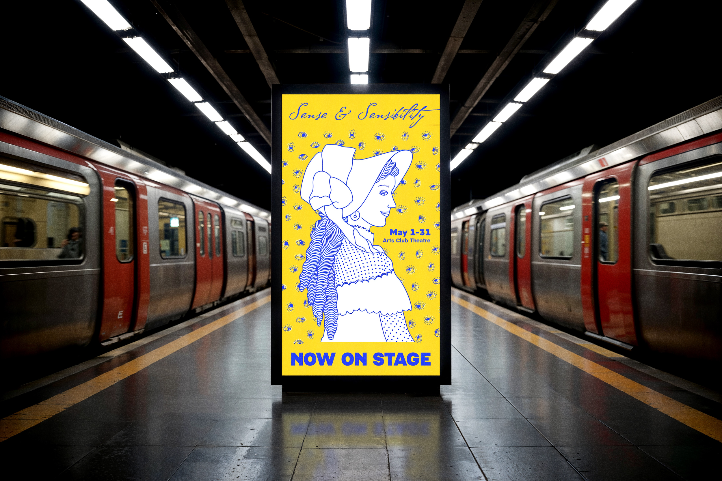
For Arts Club Theatre’s adaptation of Sense & Sensibility, the campaign identity was built through an illustration-led approach capturing the social tension, wit, and performative dynamics at the heart of Austen’s world.
The resulting visual system translates that narrative into a contemporary campaign language designed to live across every promotional format.
The Brief
Preserve the familiarity of a beloved classic while signalling a sharper, more contemporary production.
Working from the manuscript and title alone, I defined the campaign’s visual direction through an illustration-led identity designed to capture the social tension, wit, and performative dynamics at the heart of the story.
The objective extended beyond a single poster. The visual system needed to operate cohesively across every promotional touchpoint.
The Concept
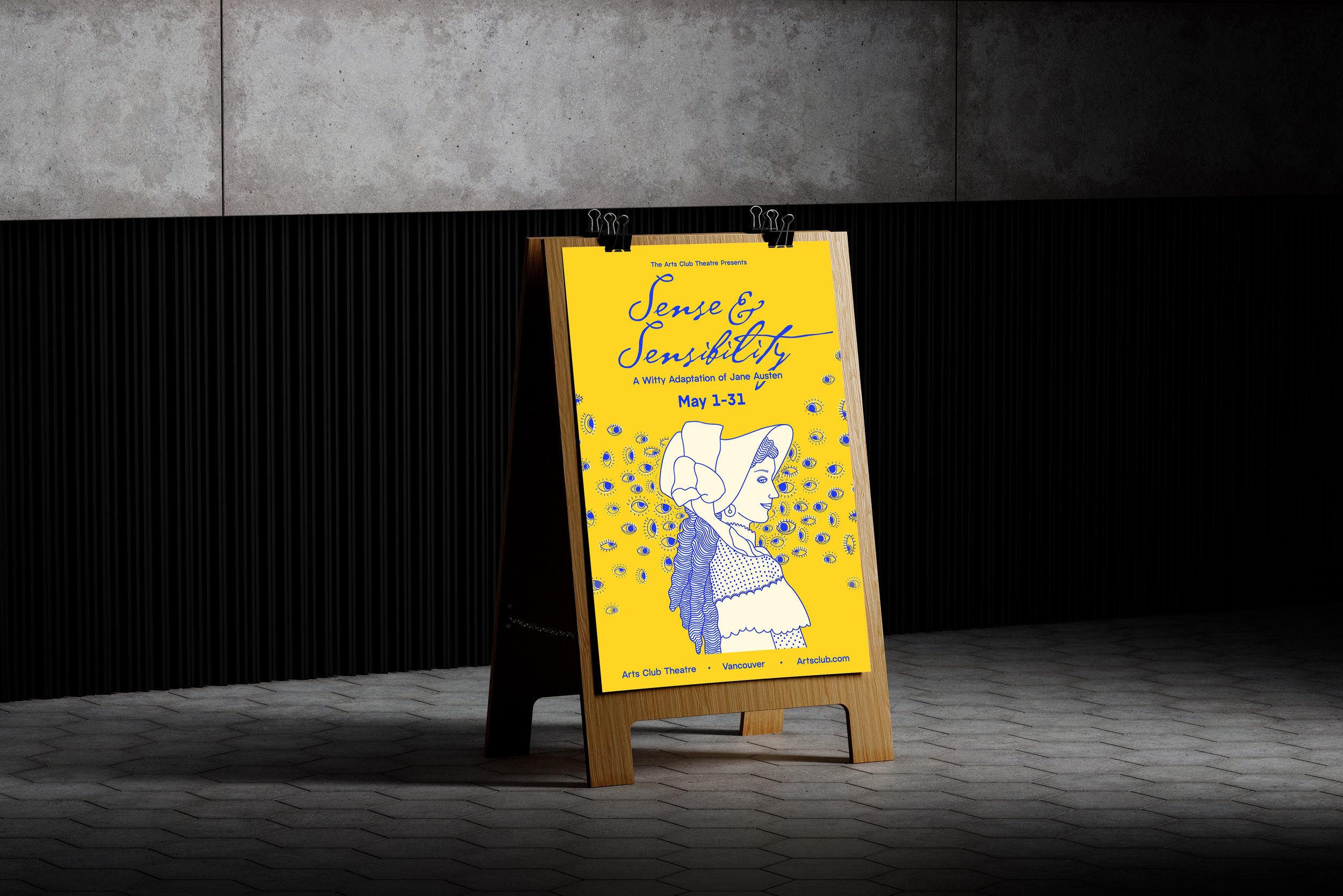
Austen’s world is built on scrutiny… a society shaped by gossip, reputation, and constant watchfulness. The “eyes everywhere” motif became the structural framework of the identity.
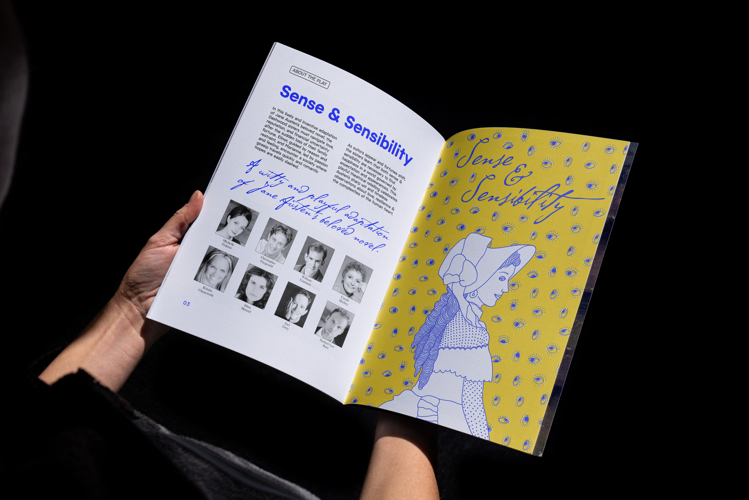
A central female figure anchors the composition, her gaze steady and her expression edged with a restrained smirk — not overt rebellion, but controlled awareness. In a world defined by social performance, she is both subject and strategist.
The surrounding eyes create visual tension and rhythm, amplifying the pressure of perception while introducing a distinctly modern edge. The identity holds tension between tradition and reinterpretation — preserving the familiar while signaling a sharper, contemporary lens.
From the outset, the illustration was developed not as a singular image, but as a scalable visual system capable of carrying the campaign across formats.








Building the System
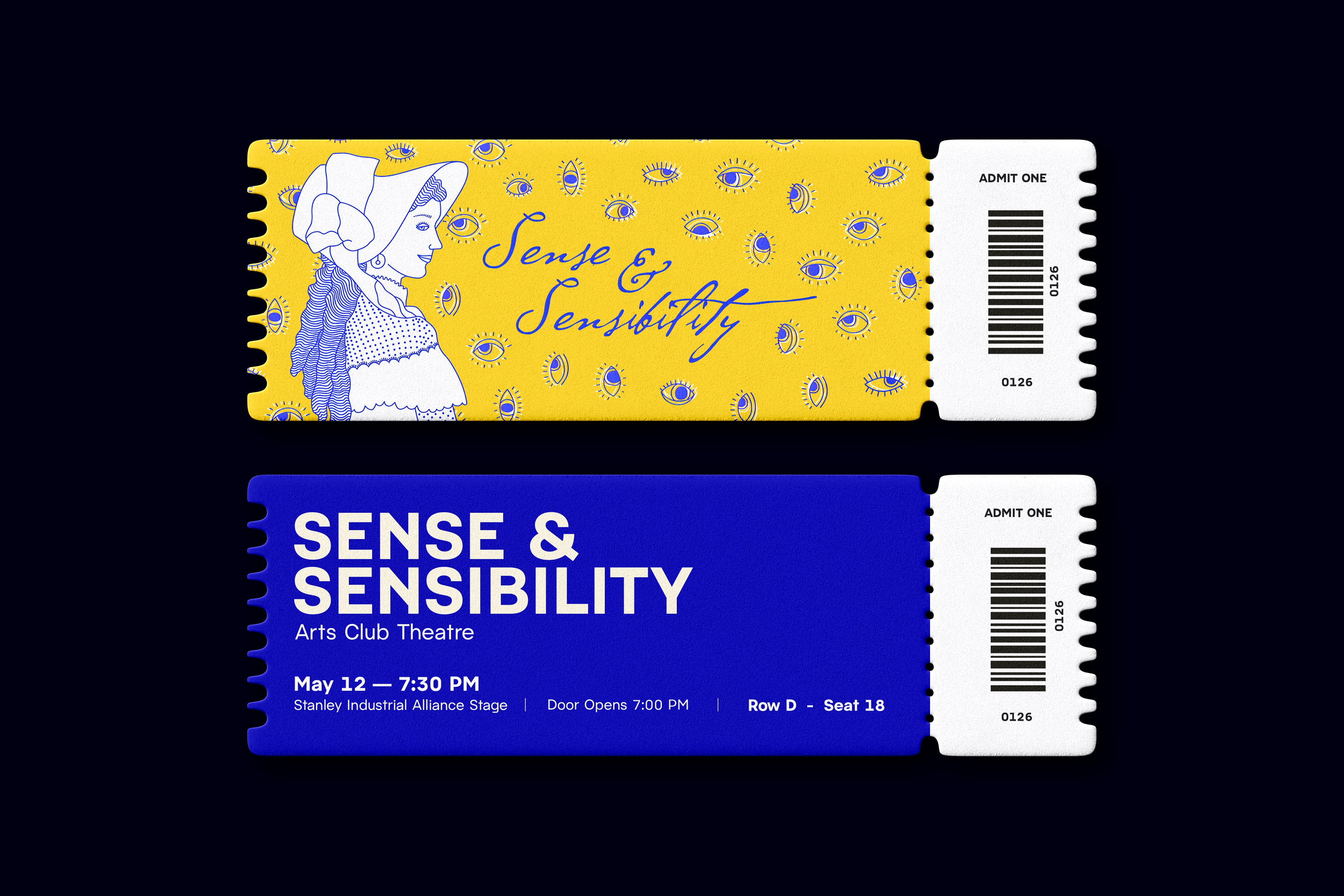
The identity extended across posters / social media / theatre programs / ticket stubs.
Each format required strategic compositional restructuring to maintain hierarchy and narrative clarity. Rather than adapting a fixed artwork, the illustration was treated as a modular system — allowing motifs, typography, and focal points to shift without compromising integrity.
Consistency was achieved not through repetition, but through structural cohesion.


The Outcome
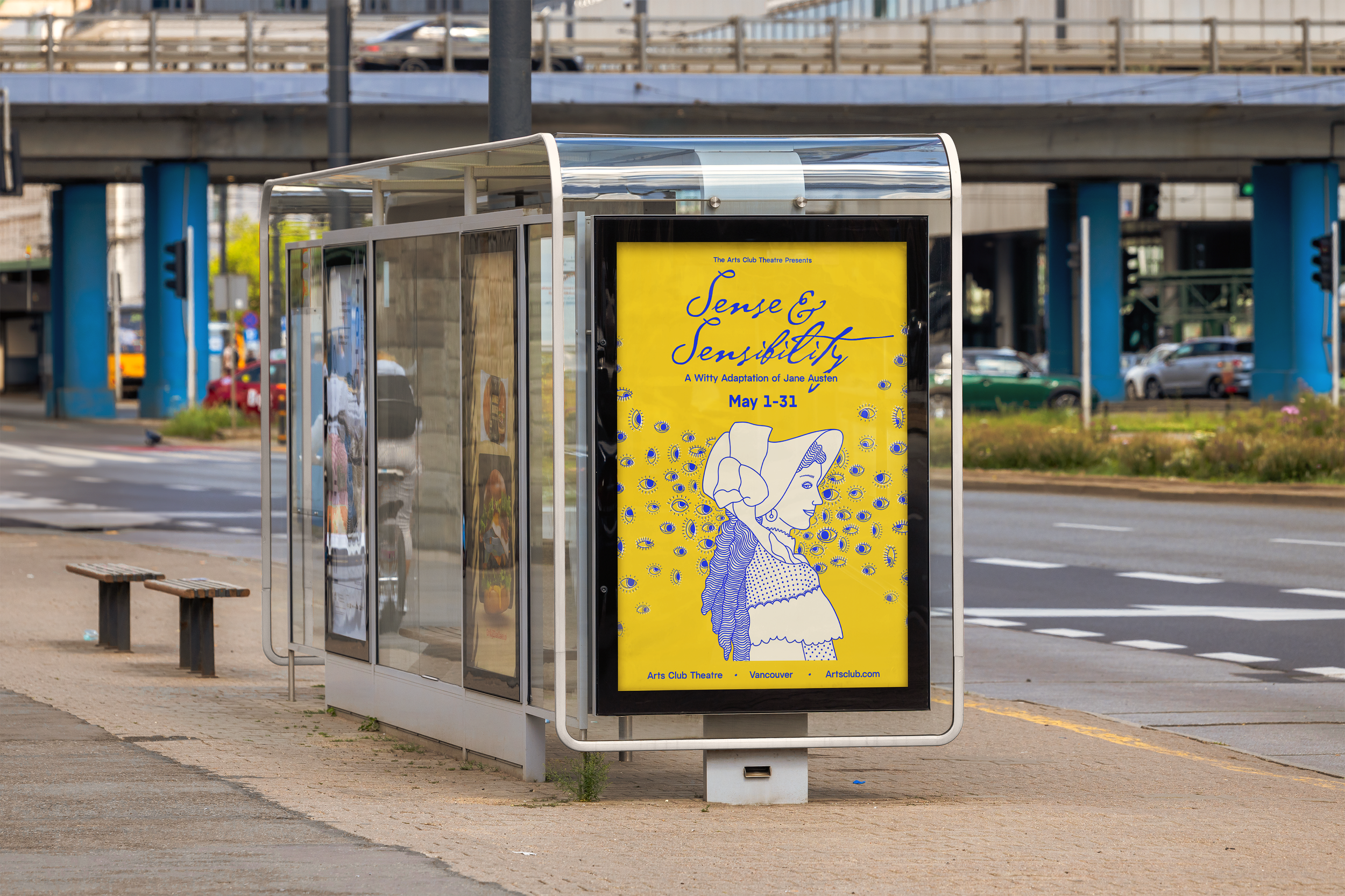
The campaign received strong internal and client approval, recognized for capturing the production’s wit and vitality while distinguishing it within the theatre’s seasonal lineup.
The identity positioned the play as both recognizable and newly energized — strengthening its promotional presence and audience appeal.
Reflection
Illustration-driven campaigns demand structural foresight. Every motif, layer, and compositional decision must anticipate scale.
When developed as a flexible system — not a singular hero asset — a visual identity maintains clarity and integrity across formats, environments, and audience touchpoints.