Visual College of art & Design
Campaign and brand application
The Visual College of Art & Design is a career-focused institution centered on creative education.
As lead designer over the past two years, I’ve worked across a fast-paced, campaign-driven environment — developing visual directions and executing assets across print, digital, and motion. From event campaigns and program launches to social content and video, the work spans a high volume of touchpoints, each designed to capture attention and drive engagement.
Beyond production, the role became an opportunity to evolve the brand — refining its visual language to feel more current, expressive, and aligned with the kind of creativity the school aims to inspire.
The Brief
Translate an established brand into a continuous stream of campaign work across formats and platforms.
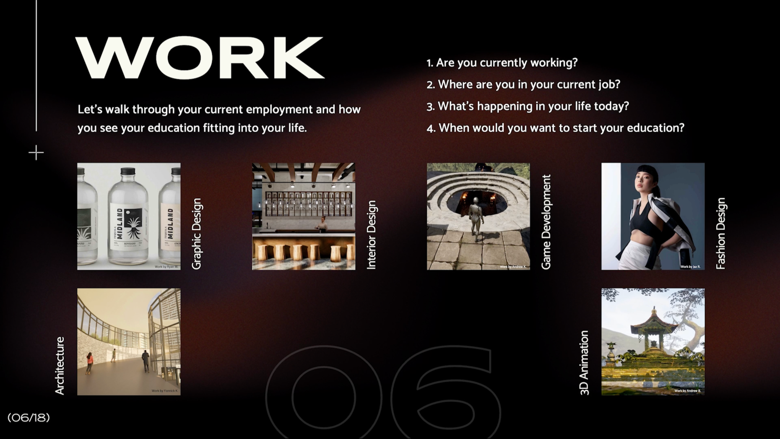
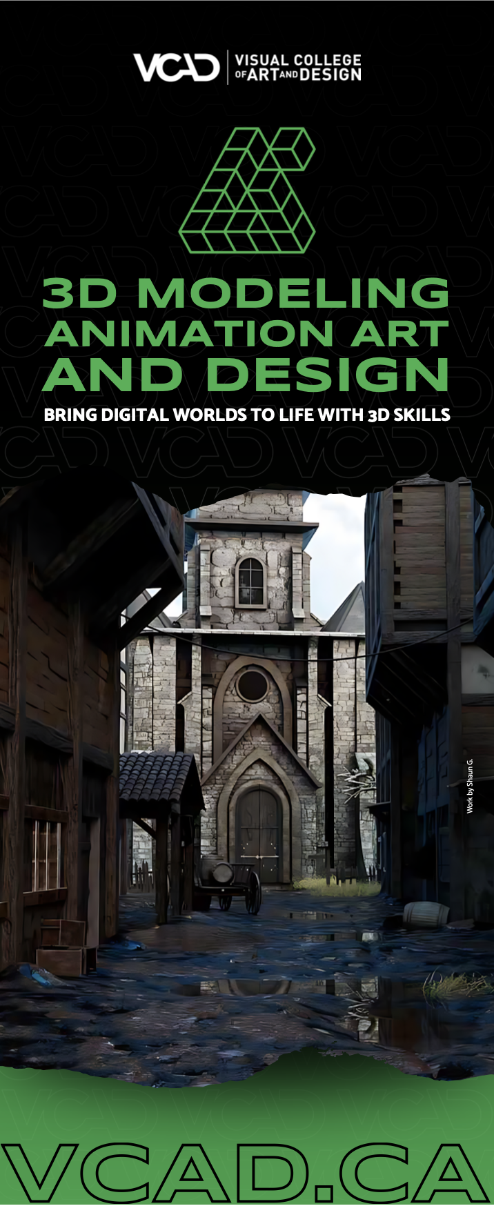
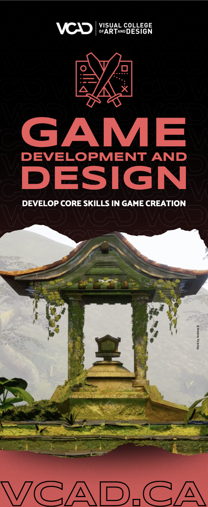
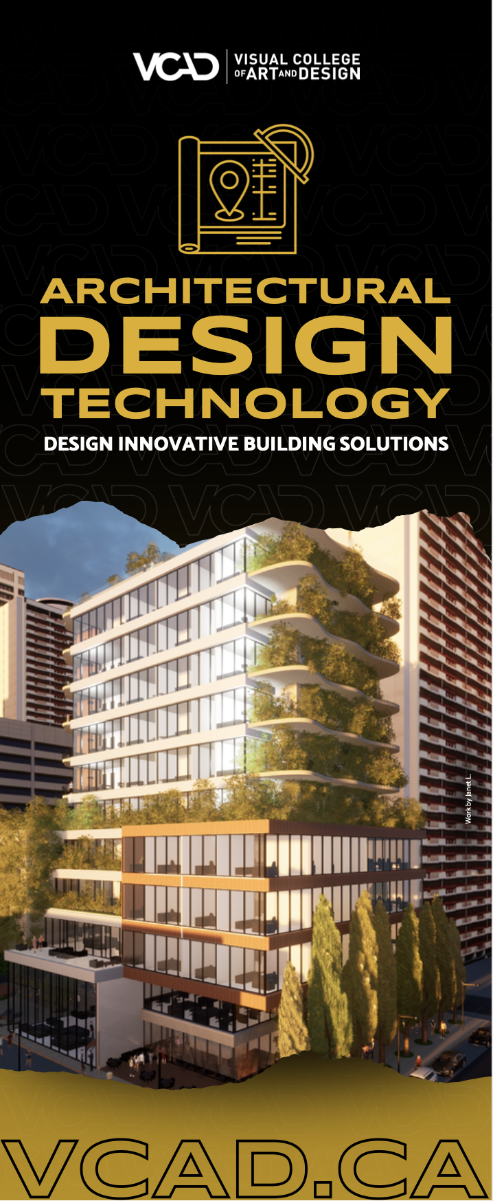
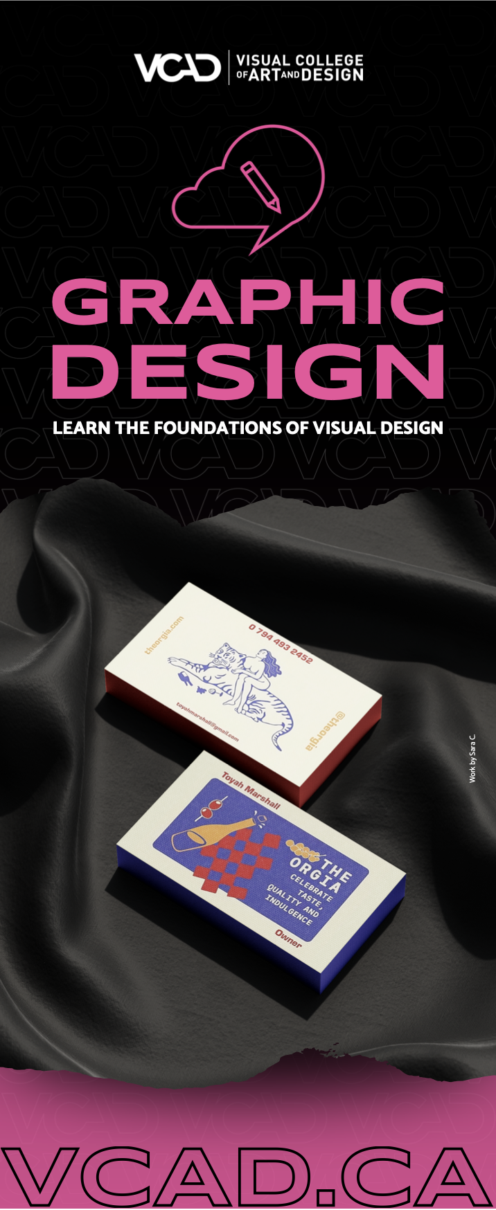
With a high volume of deliverables — including virtual open houses, portfolio shows, career fairs, and speaker events — each campaign required a distinct visual presence while still feeling recognizably VCAD.
The challenge wasn’t just consistency, but momentum: how to keep the work feeling fresh, engaging, and scroll-stopping, while working within a defined set of brand elements and expectations.
The Concept
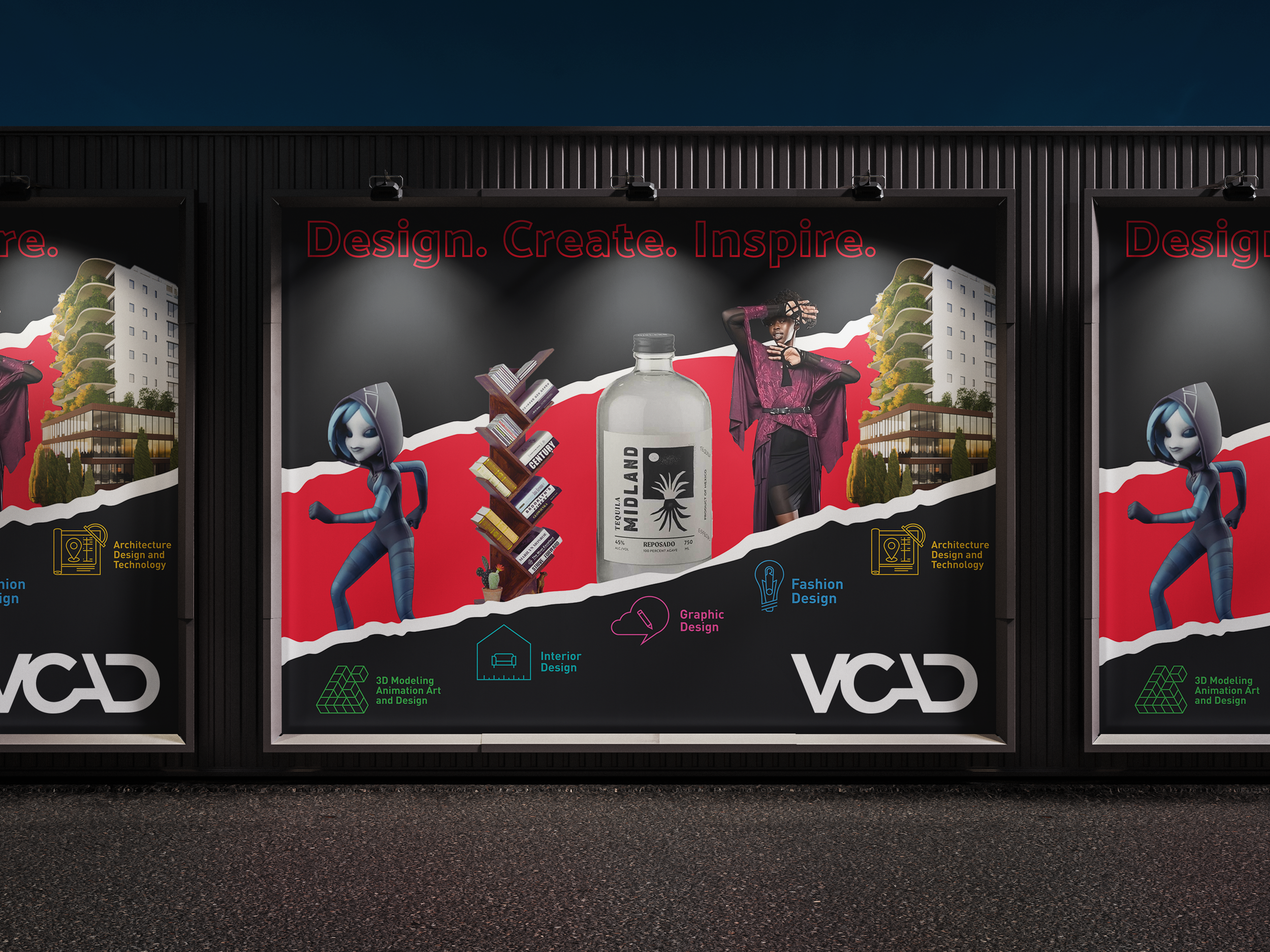
Rather than relying on static layouts, the work is driven by a more fluid, expressive system.
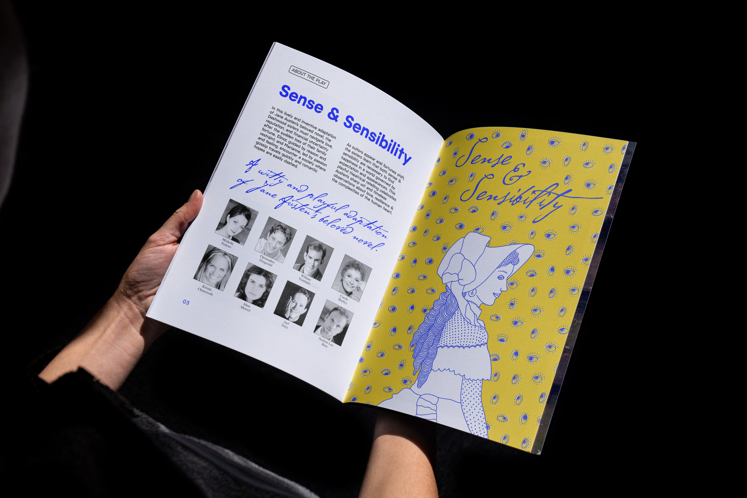
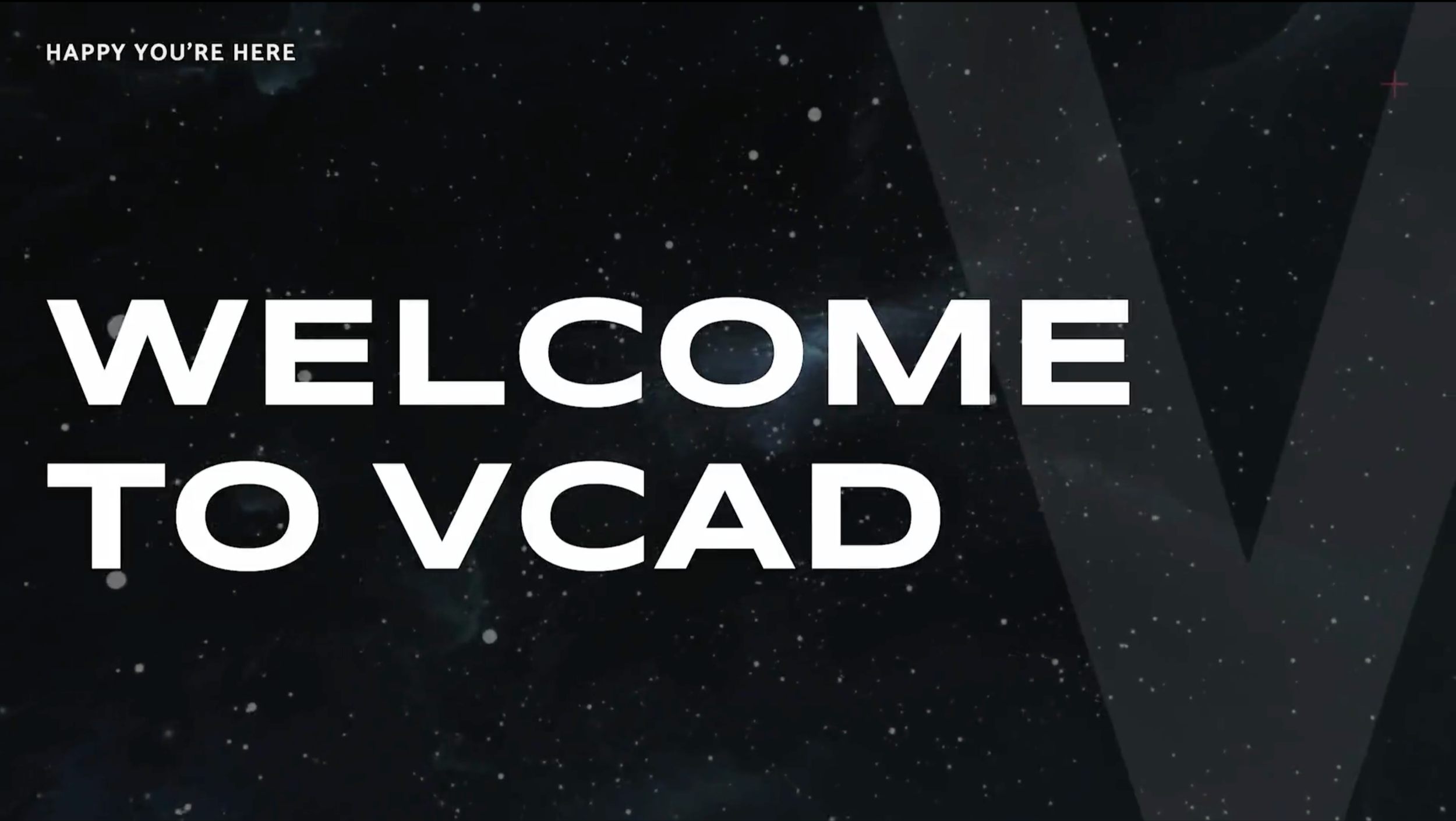
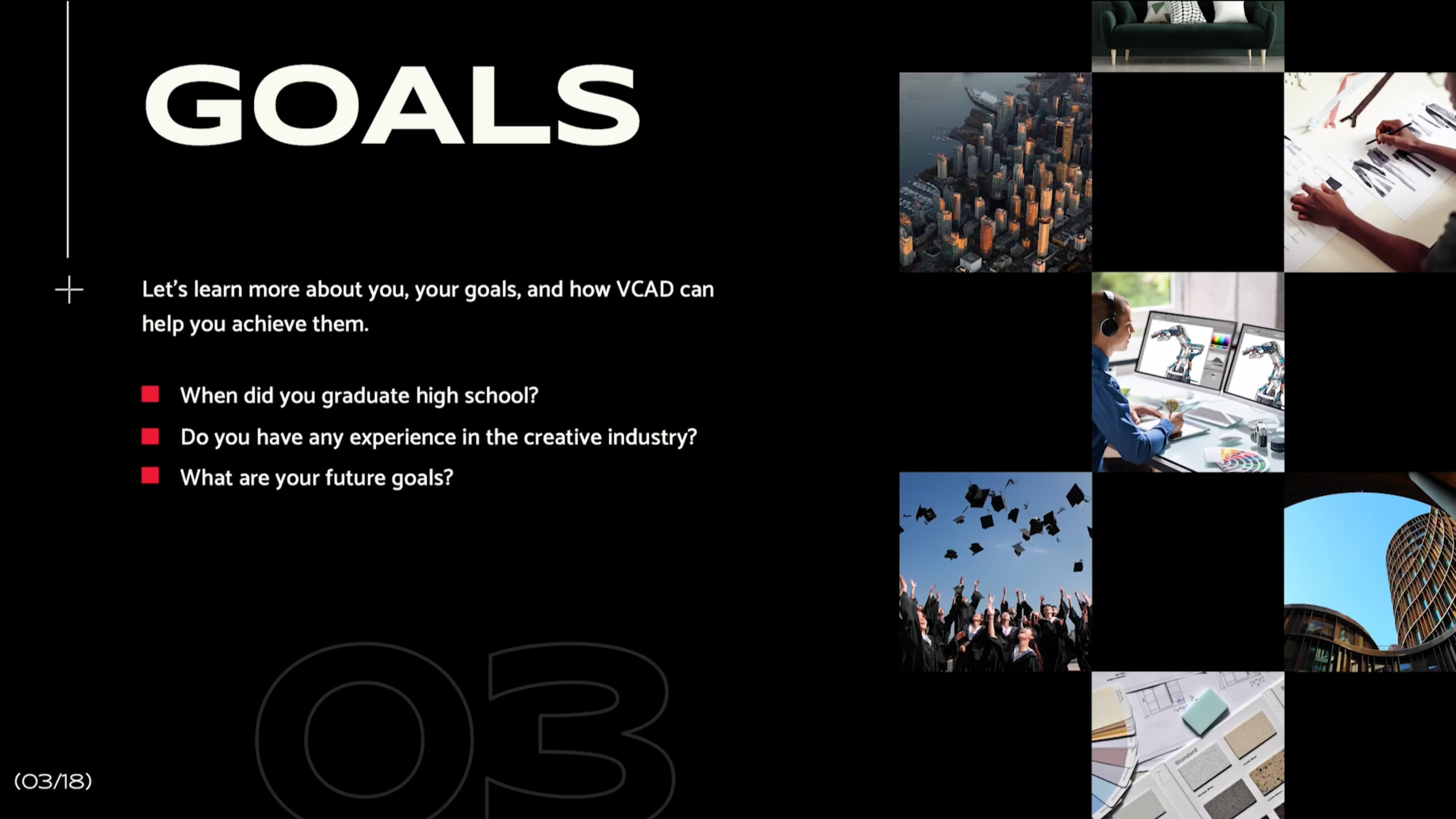
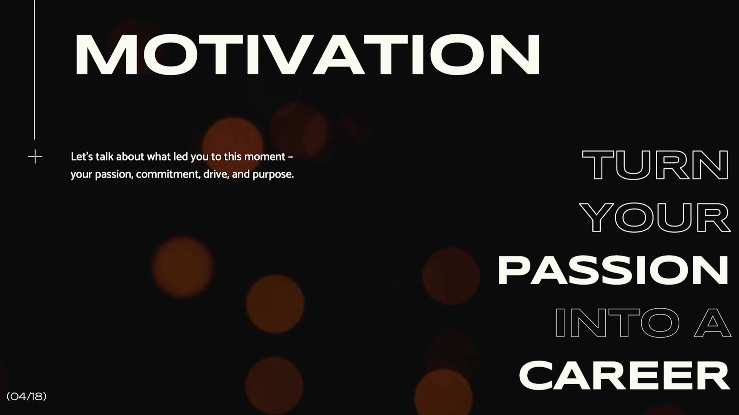
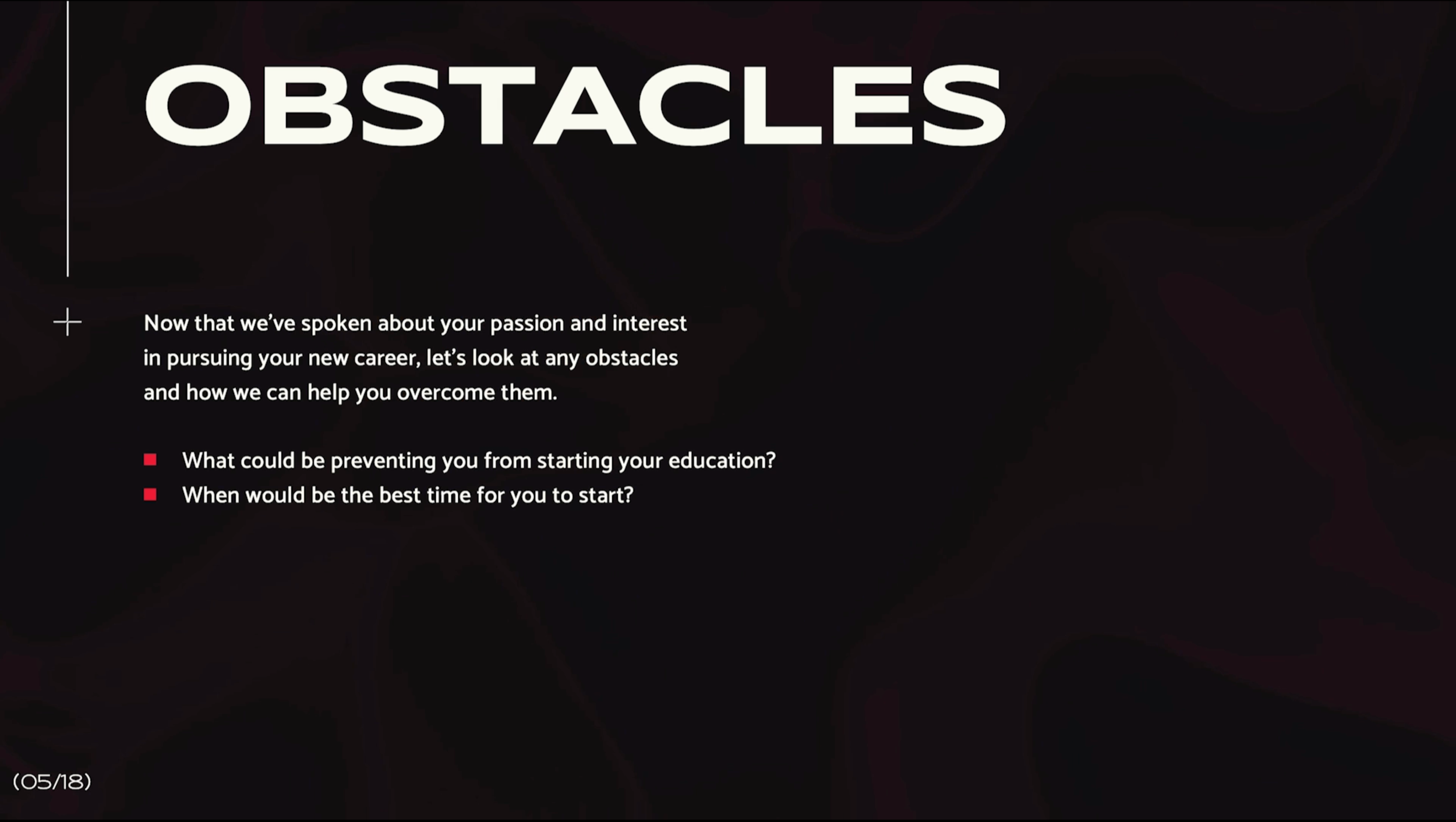
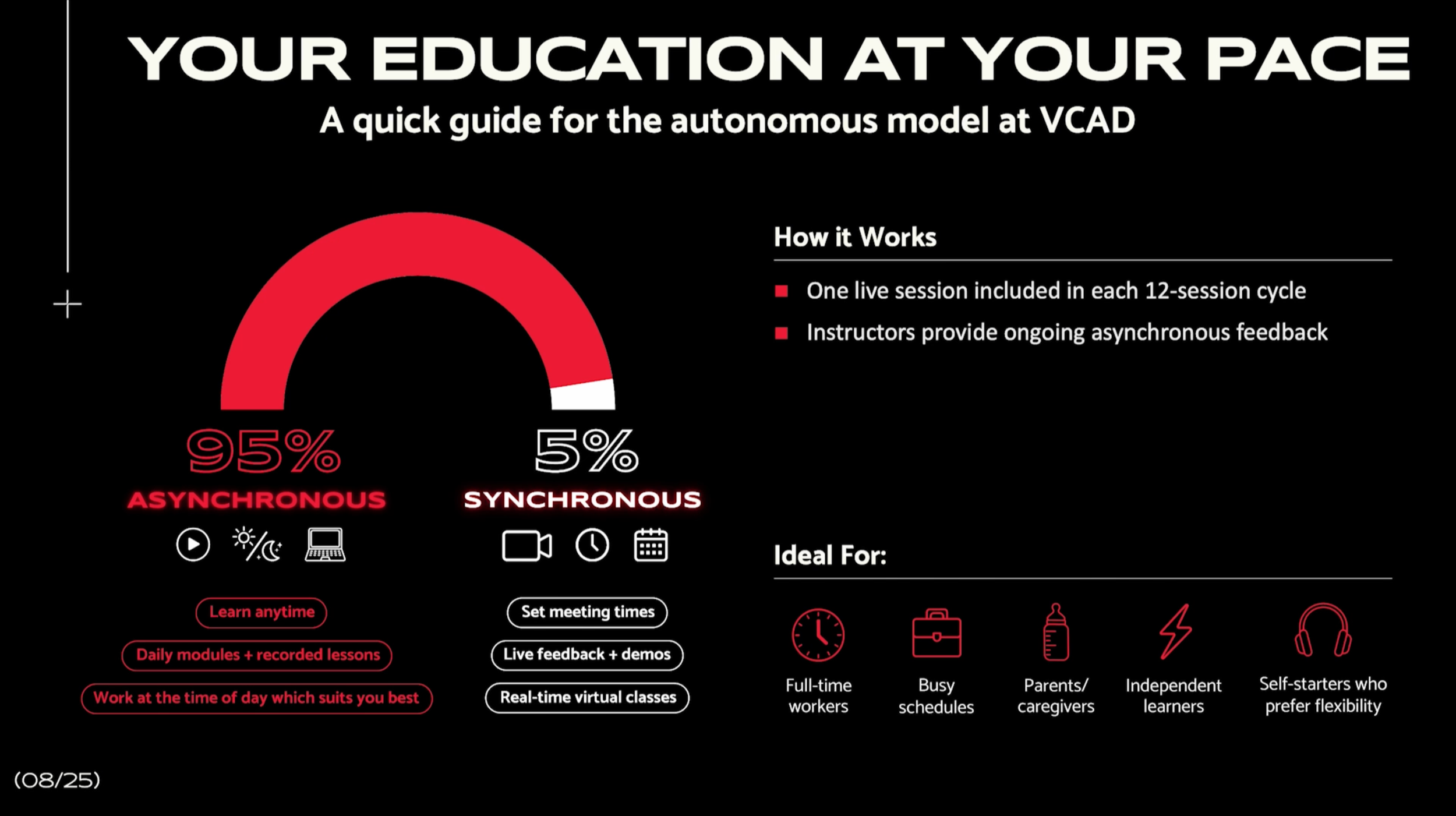
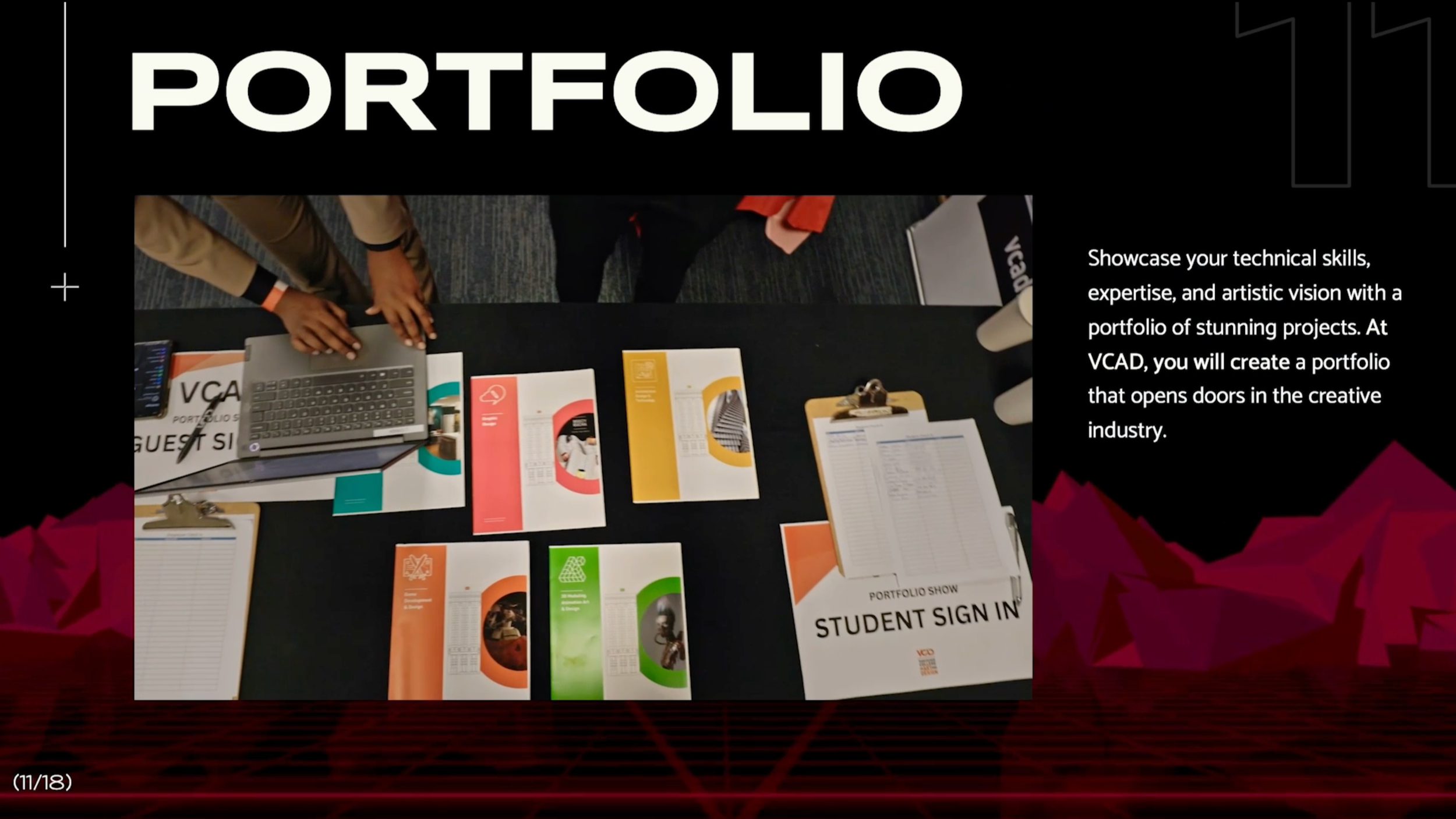
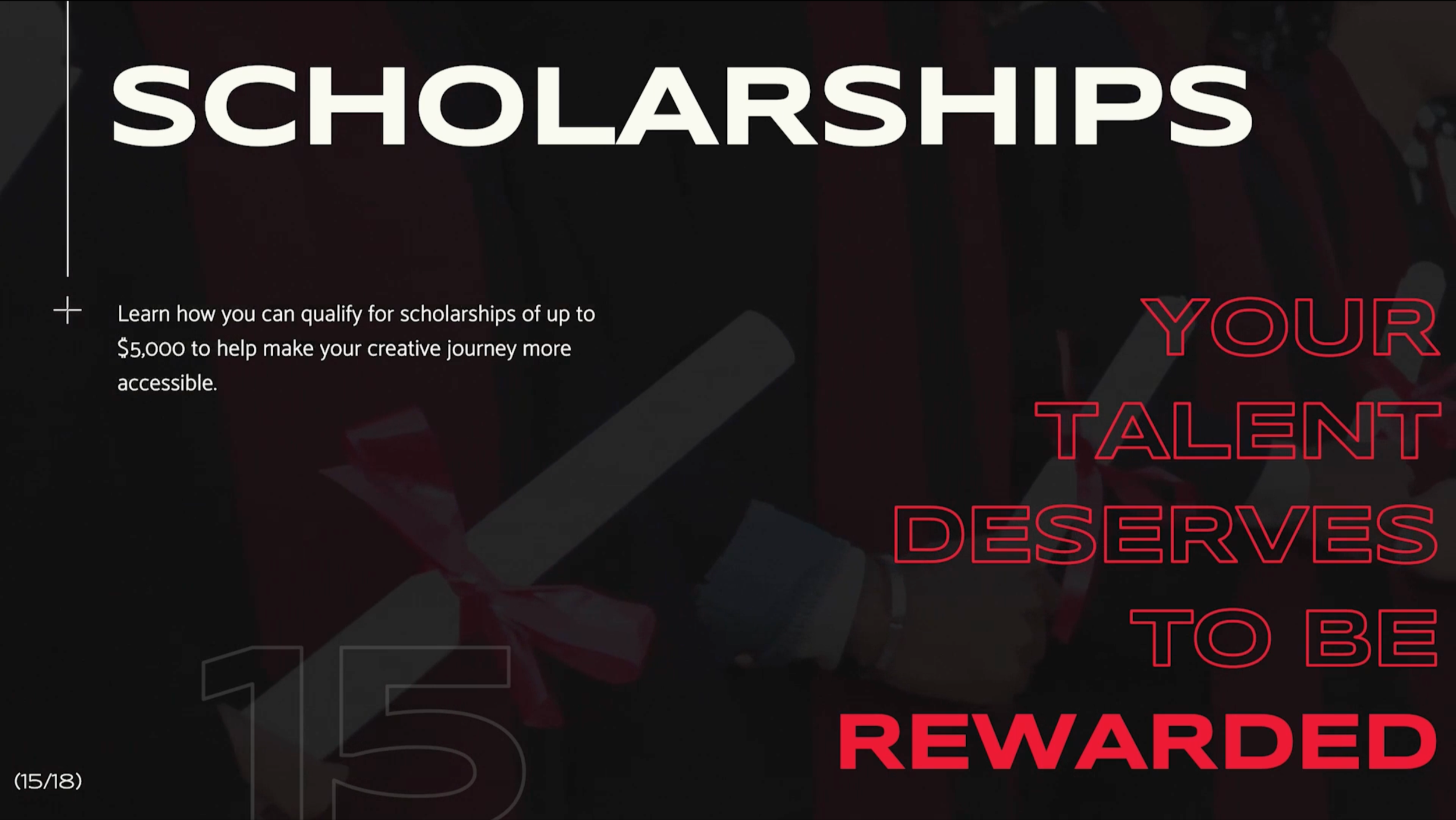
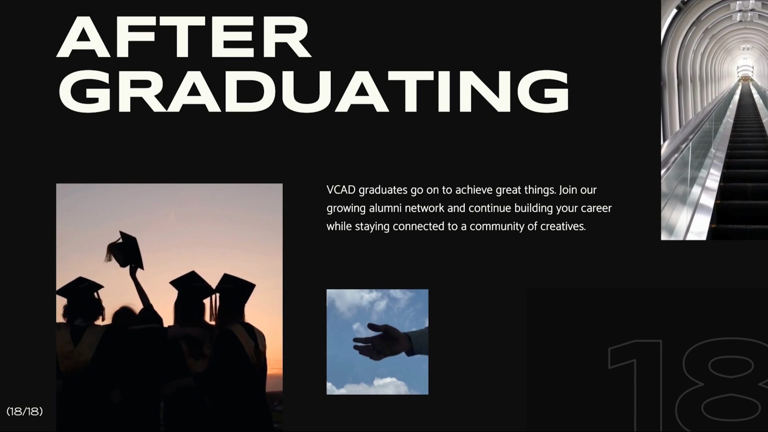
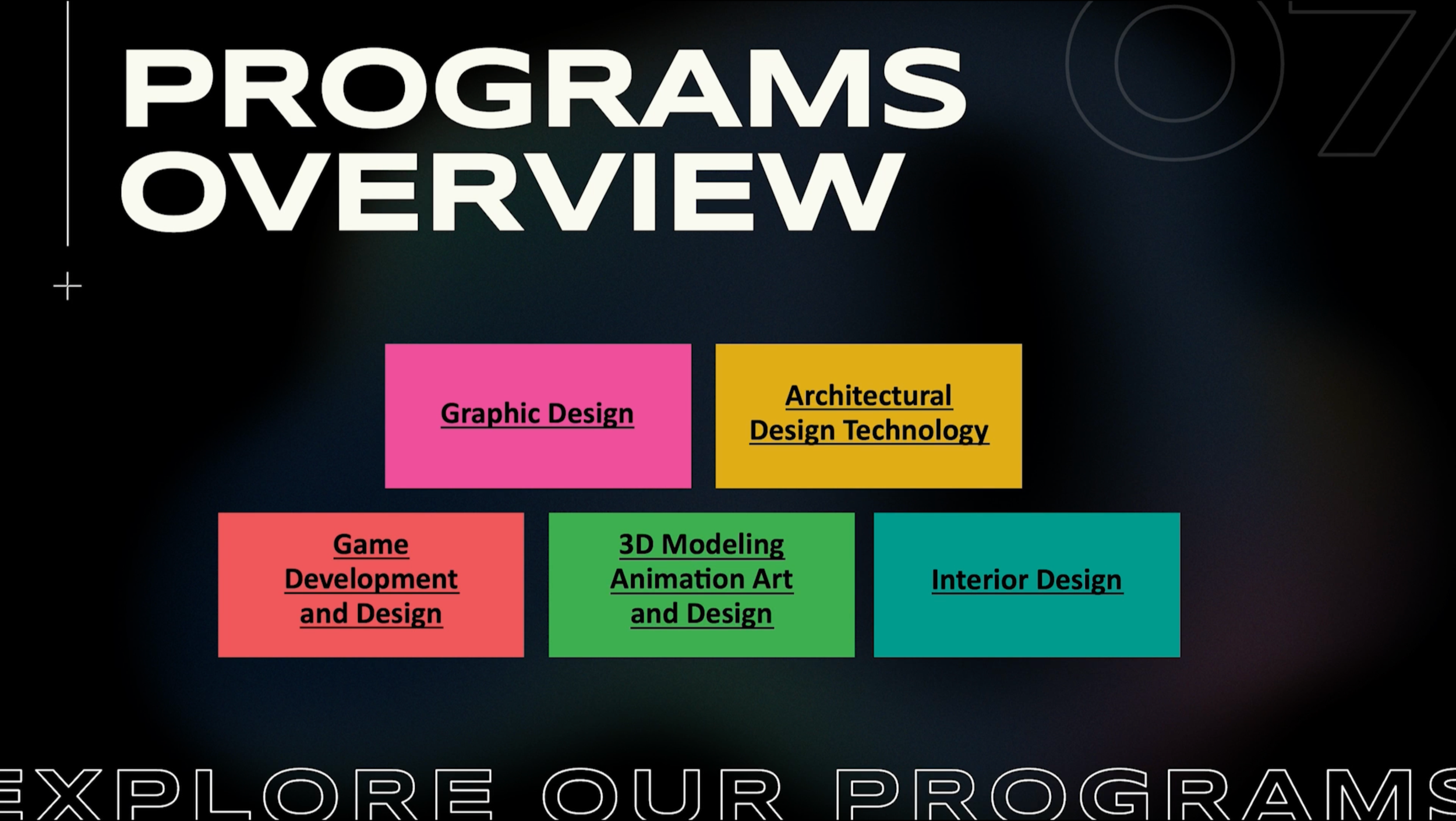
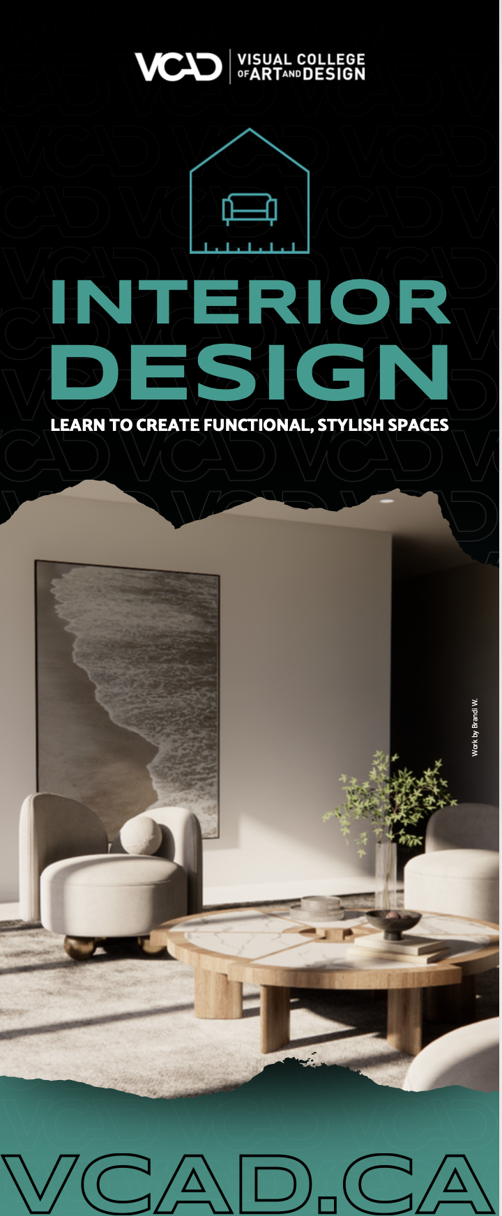
Each campaign explores variation through scale, contrast, and composition, using bold typography, high-impact colour, and student work to create energy and immediacy. Elements like outlined type, all-caps headlines, and sharp hierarchy help guide attention quickly.
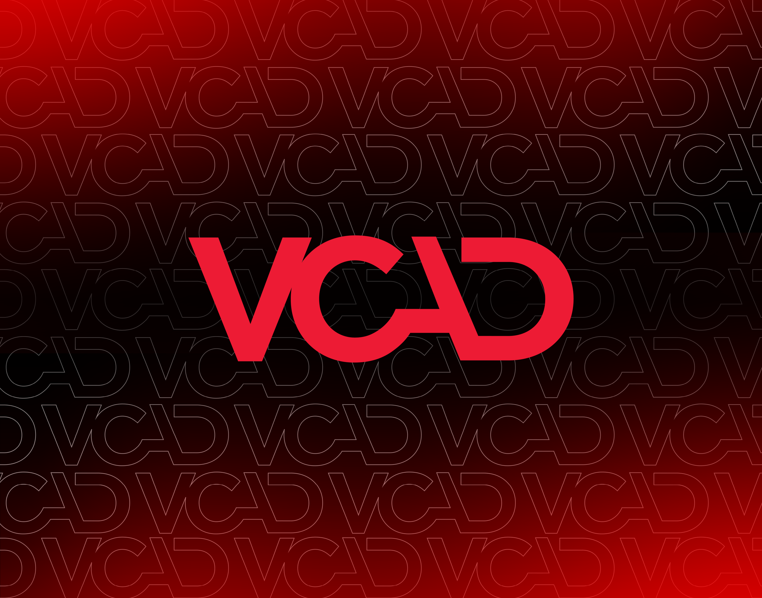
A set of refined visual anchors — the red glow gradient, subtle logo-outline patterns, and deeper charcoal tones — bring consistency, while allowing each piece to feel distinct. The intention is to reflect the same creativity and confidence the school aims to inspire.


Building the System
Each campaign starts from scratch, with a focus on making deliverables clear, engaging, and scroll-stopping.
Core information is structured for quick readability, while layouts shift depending on format and context. Key elements — the red gradient, logo patterns, and typographic treatments — are reused and reinterpreted, creating continuity without repetition.
Alongside static work, I led the creation of program videos and testimonials, extending the visual language into motion.


The Outcome
The brand has evolved into a more modern, expressive system — replacing older elements with a stronger sense of contrast, energy, and flexibility.
This shift contributed to increased engagement across campaigns, including the top-performing ad across all school brands — driving strong results for the Graphic Design program.
More importantly, the work better reflects the level of creativity the institution promotes.
Reflection
This project reinforced that strong systems leave room to move.
Working within constraints became an opportunity to refine and push the brand forward — proving that even small, intentional changes can significantly elevate how a brand feels.
It’s shifted how I approach existing identities: as foundations to build on, not boundaries to stay within.