Mitch’s
catch
Infographic Map for Brand Identity
Mitch’s Catch is a Vancouver-based, women-run seafood company delivering sustainably caught, sashimi-grade tuna directly from the boat to table.
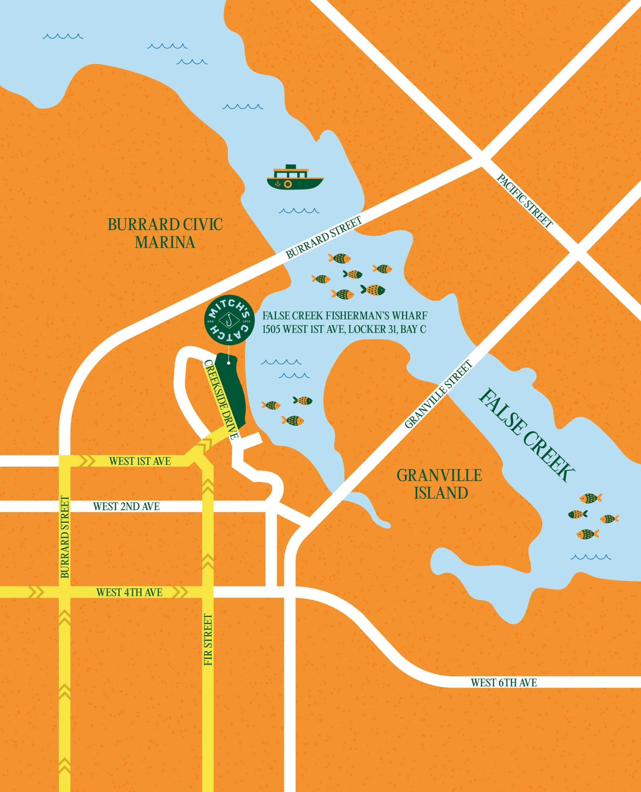
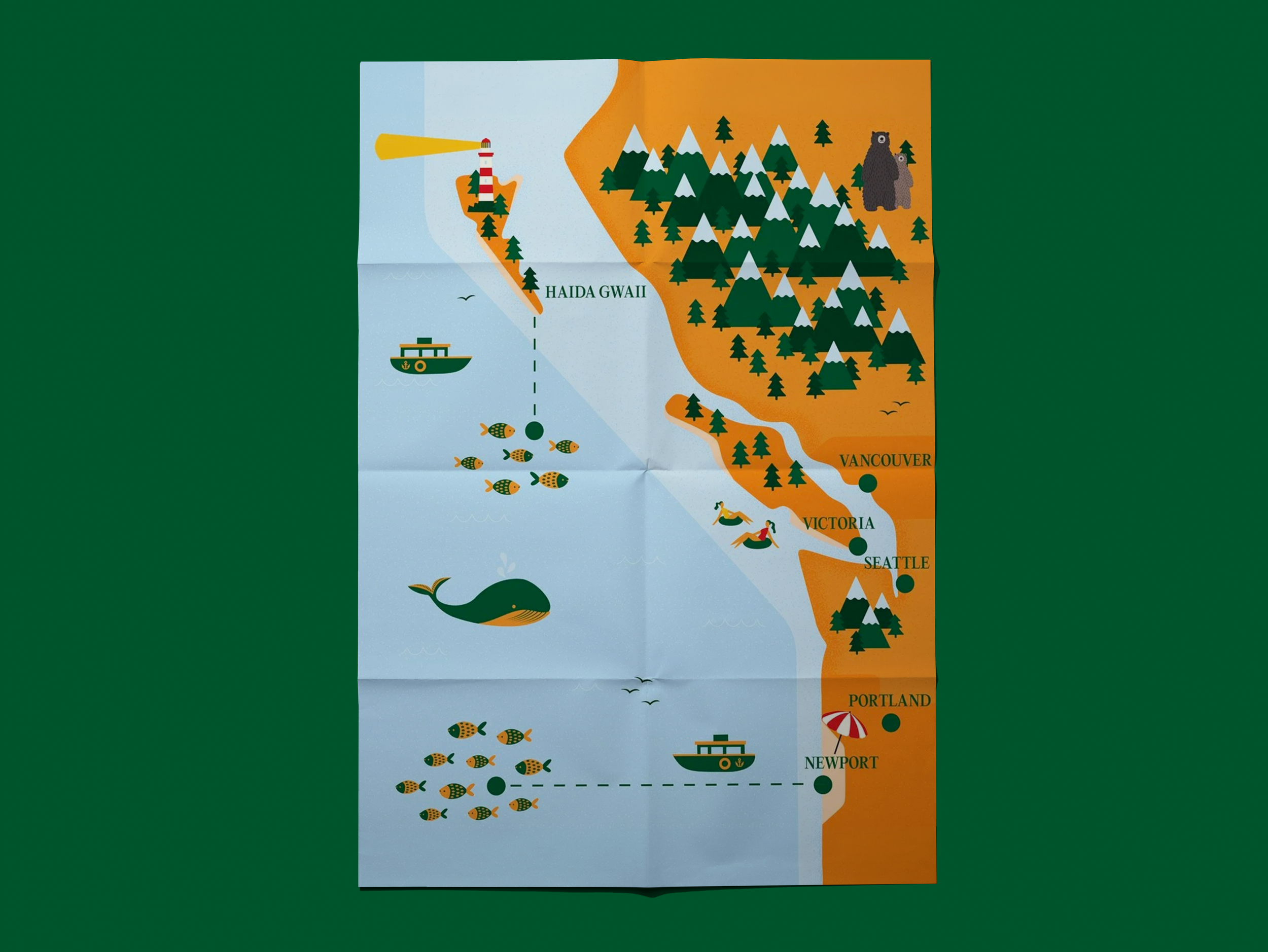
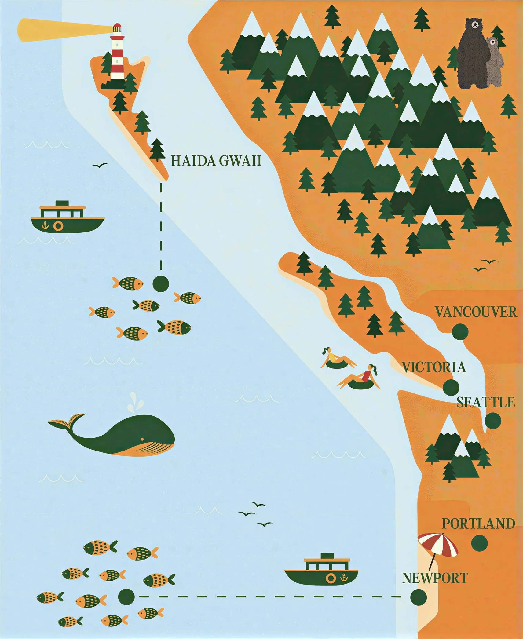
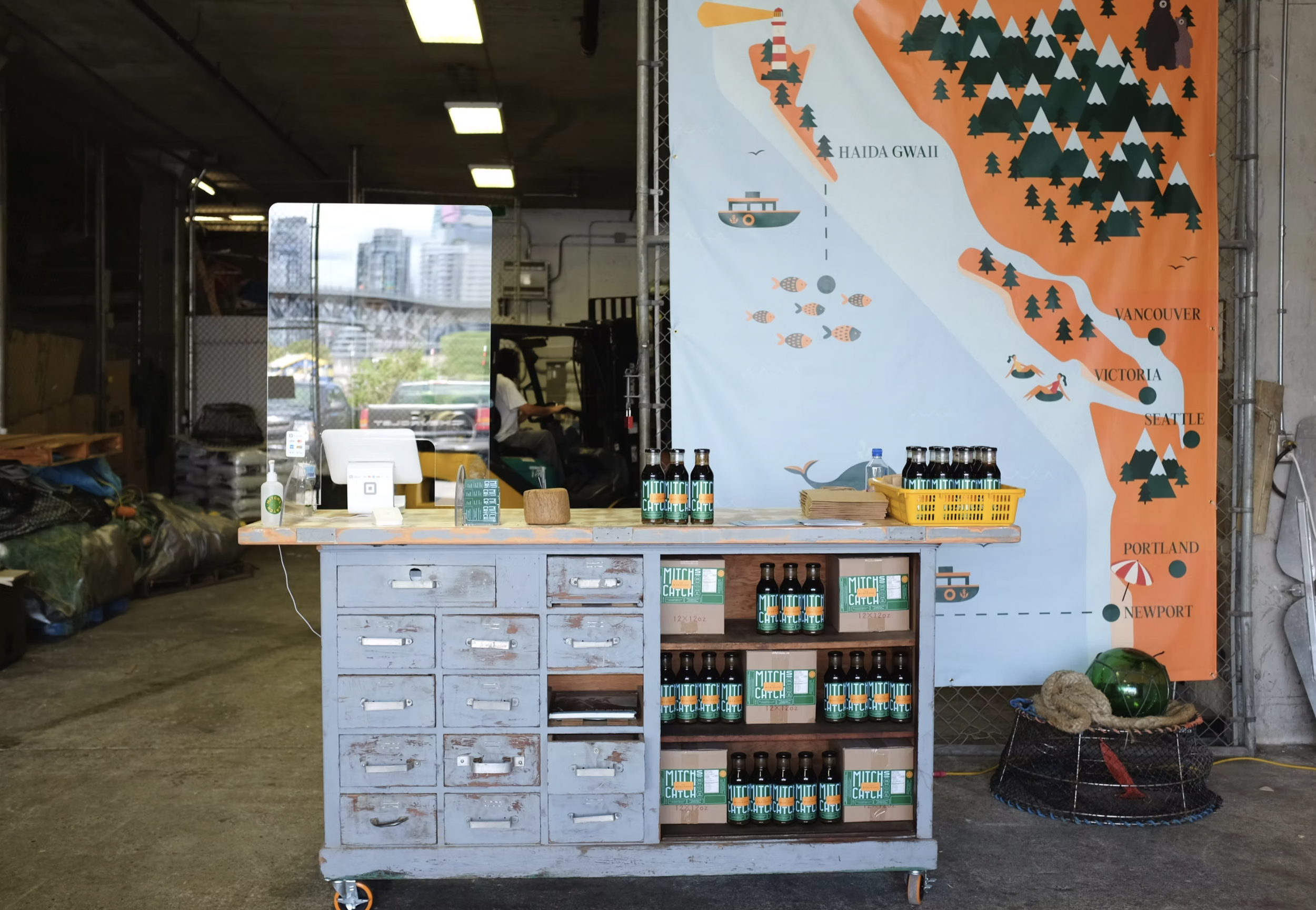
A custom illustrated map was developed to communicate sourcing and geography within the brand, functioning as an infographic that shows exactly where the fish is caught. It grounds the identity in place, mapping the origins of the catch across packaging and digital applications.
The Brief
Reposition the brand to feel trustworthy, contemporary, and grounded in its sourcing, while appealing to an audience that values quality, storytelling, and transparency in their food.
The map was developed to clearly communicate where the product comes from — translating geography and sourcing into an accessible visual format. It functions as a clear reference point for customers, reinforcing trust in the brand’s local sourcing.
Designed to extend across packaging and digital applications, it needed to maintain clarity while supporting the broader identity system.
The Concept
The map draws from the geography and ecosystems of the Pacific Northwest, using a dense field of illustrated elements to reflect the richness of the region and the activity surrounding the catch.
Fishing boats, marine life, coastal landmarks, and human presence are layered throughout the composition — balancing clarity with detail to create a system that feels both informative and exploratory. The approach merges infographic structure with a more expressive visual language, allowing the map to communicate sourcing while maintaining a sense of character and place.
Rather than functioning as a literal geographic rendering, the map is selectively constructed to emphasize key regions and moments within the supply chain, prioritizing legibility and storytelling over strict accuracy.
Building the System
The map was designed to function across packaging and digital applications, requiring flexibility in scale and use.
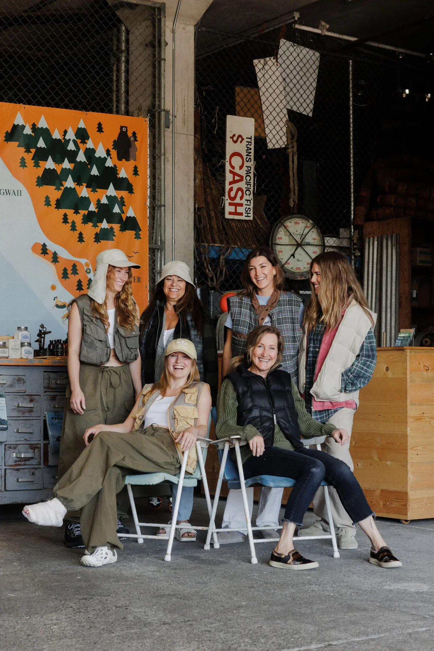
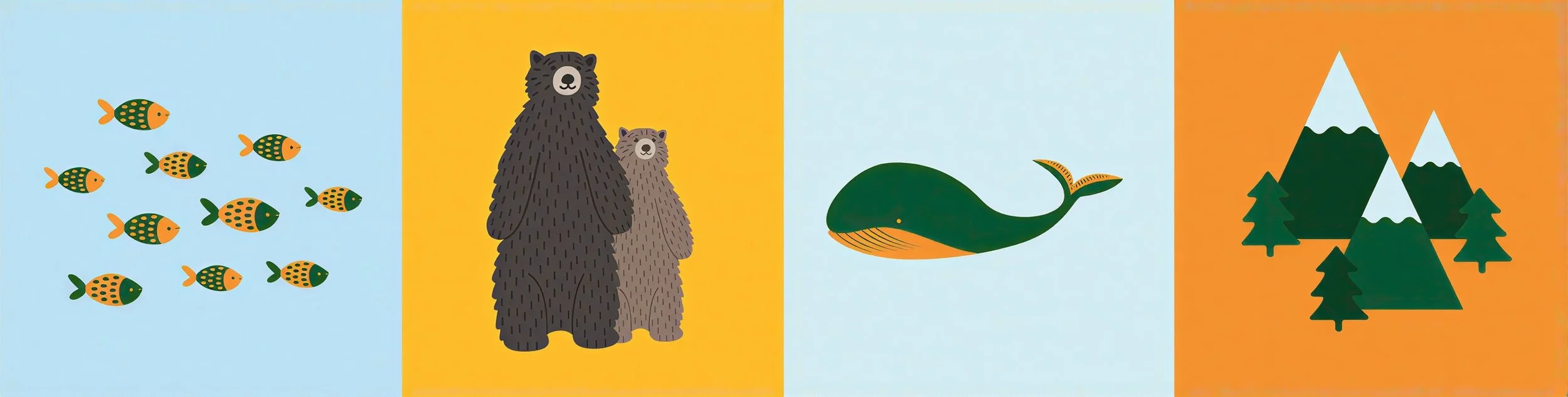
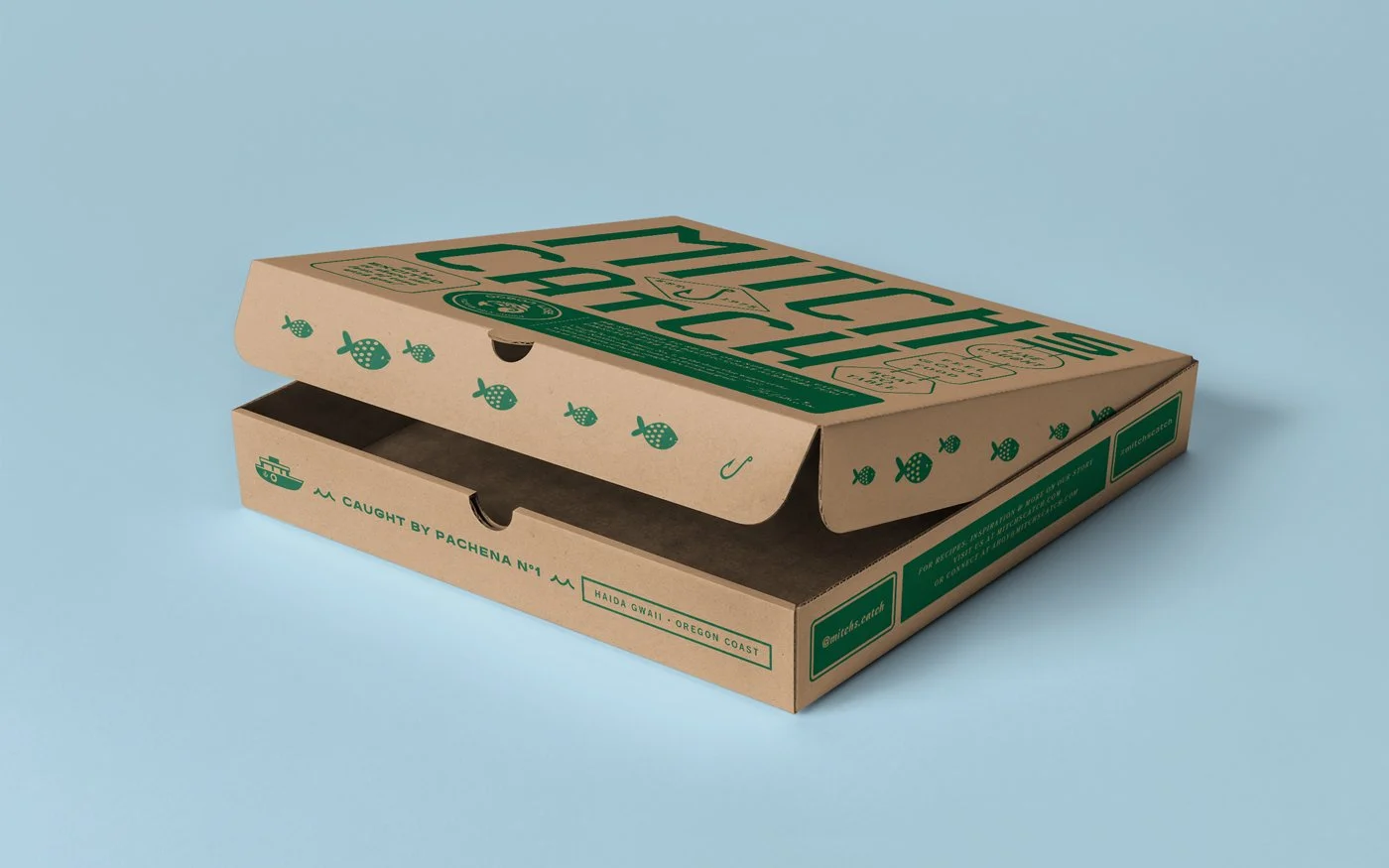
The full illustration communicates a broader sense of place, while cropped sections and individual elements — such as the fish — are used across packaging and the website. This approach allows the map to adapt to different formats without losing clarity or character.
Consistency is maintained through the illustration style and geographic structure.
Packaging design by Carter Hales Design Lab, Illustration by Tatiana HoecklinThe Outcome
The map was integrated across packaging and digital touchpoints, supporting the brand’s emphasis on local sourcing and transparency.
As part of the broader identity, it adds a clear sense of place and reinforces the connection between product and origin, contributing to a more engaging and informative customer experience.
Brand identity by Carter Hales Design Lab in collaboration with Redshift Collective, Illustrated Map by Tatiana HoecklinReflection
Designing with illustration as an informational tool requires clarity in both content and composition. Each element must balance visual interest with legibility, ensuring the information remains accessible at different scales.
When treated as a system rather than a static asset, illustration becomes a powerful tool for both communication and identity.