Sage Pharmacy & Medical centre
Brand Identity
A new pharmacy and medical centre designed to feel calm, capable, and community-oriented.
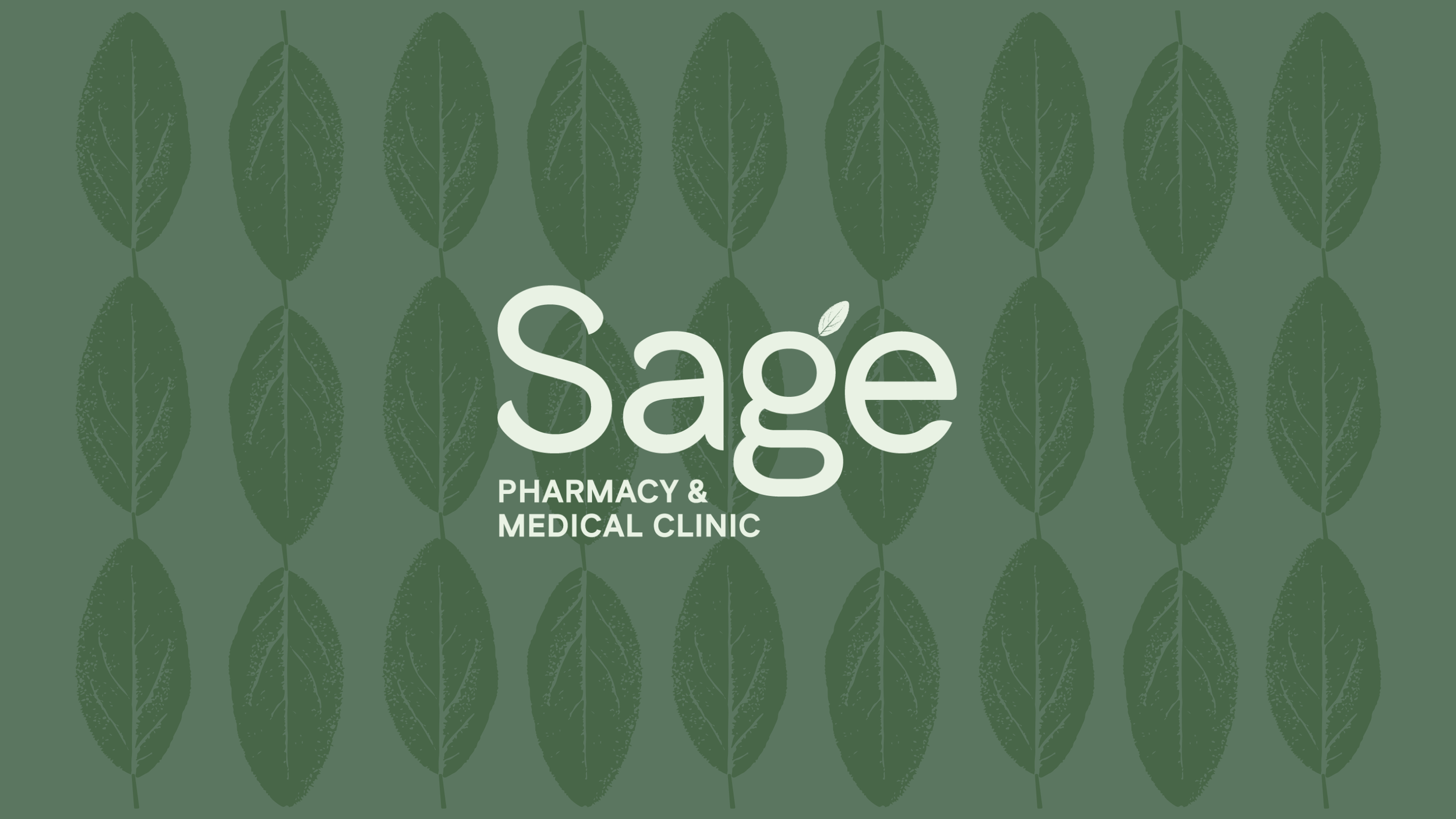
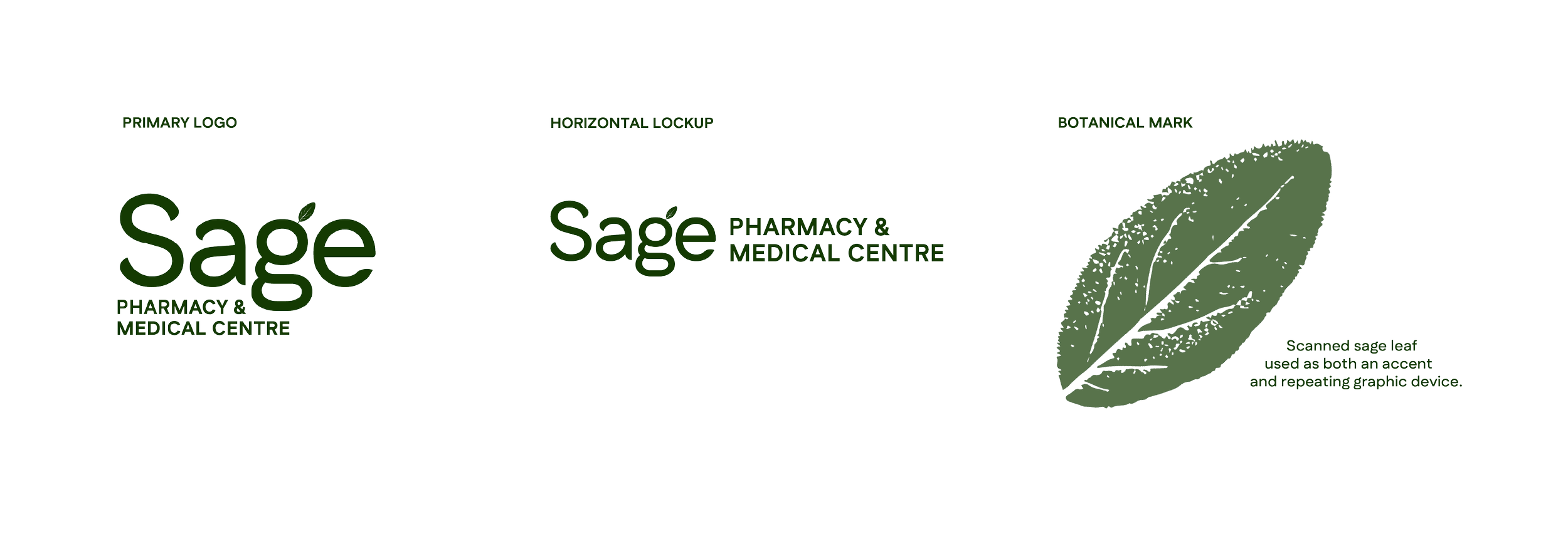
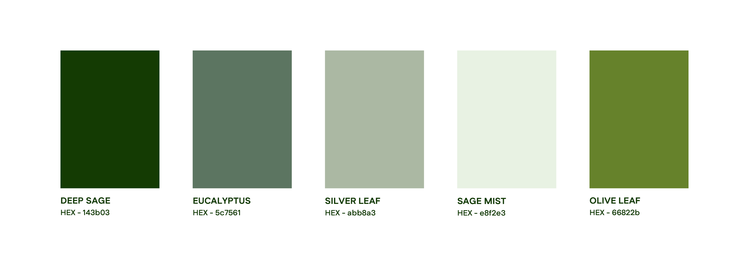
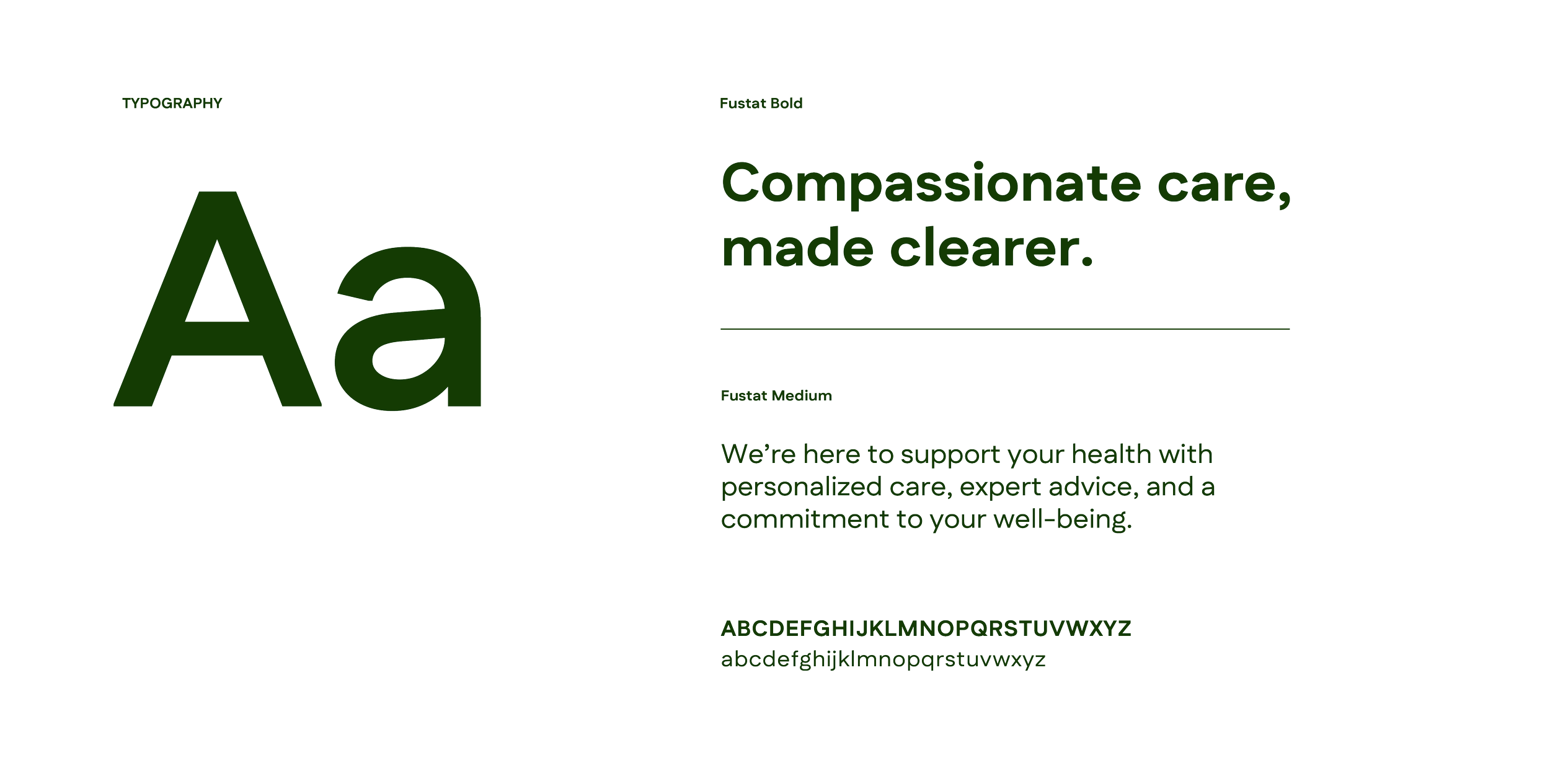
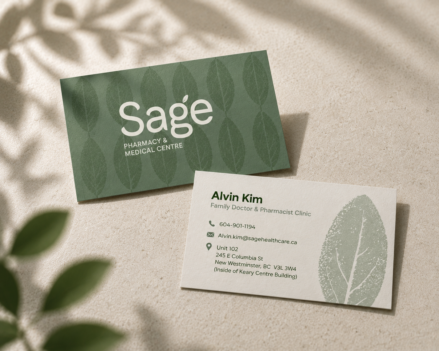
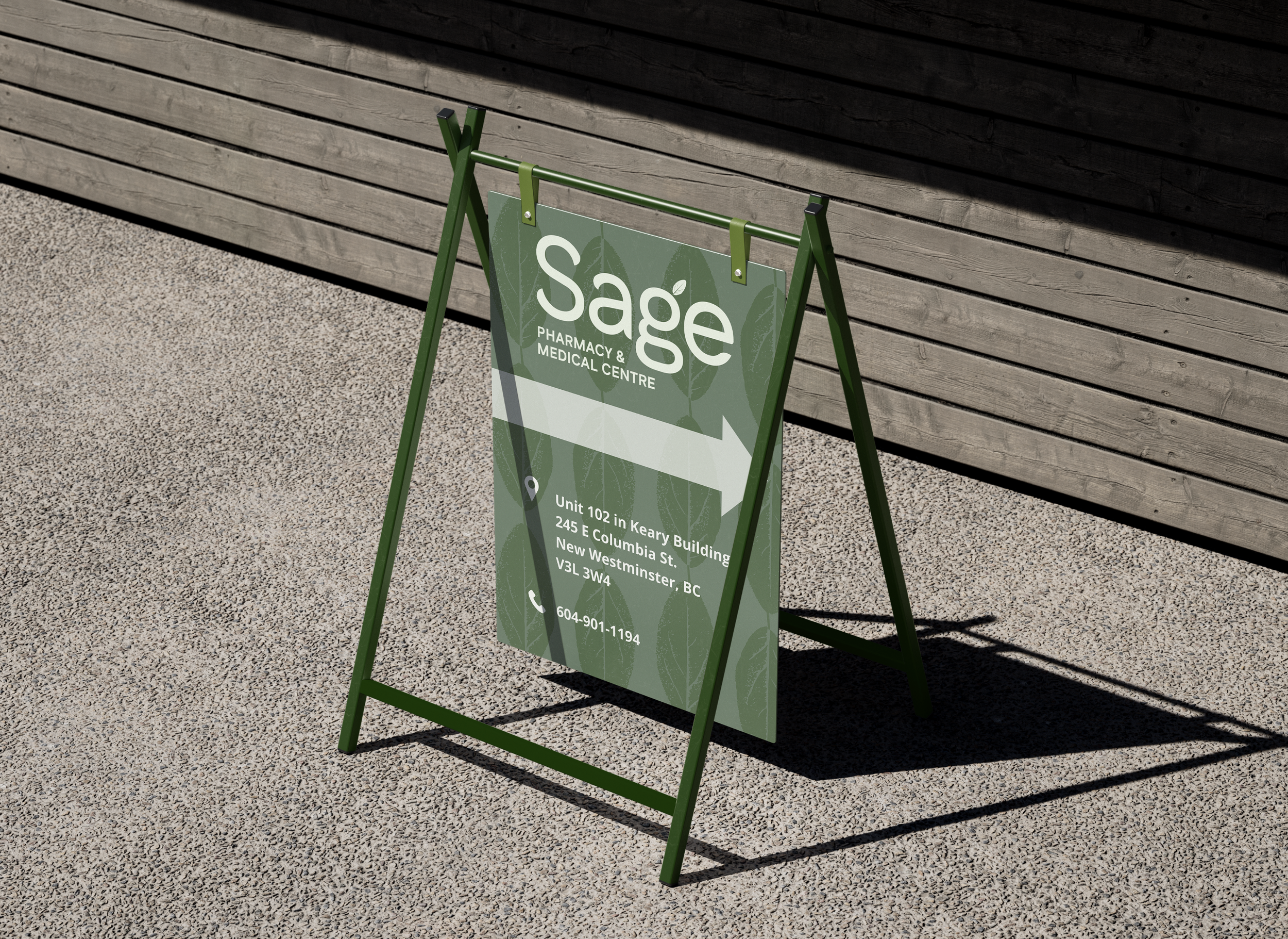
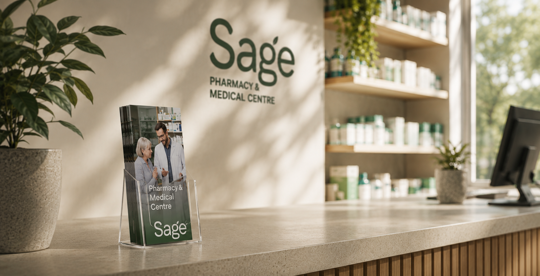
I developed the selected identity, creating a custom wordmark and visual system rooted in natural cues. A scanned sage leaf is woven into the typography, introducing a subtle, organic detail that softens the brand and reinforces its name. Paired with a deep green palette and refined typography, the result shifts the experience away from cold, clinical norms toward something more grounded, approachable, and quietly premium.
Logo design / colour palette / typography / pattern / brand applications